Information Architecture Redesign for Audible
THE PROJECT
This assignment was completed for HF740: Information Architecture. I was tasked to improve the navigational structure of an existing website, both desktop and mobile, to facilitate a simpler, more intuitive user journey. The final deliverable included key scenarios, user flows, current and revised sitemaps, and wireframes. For my project I selected Audible.com, the world’s largest seller and producer of audiobooks.
THE PROCESS
Preliminary Research
Before redesigning the navigation structure, I studied Audible’s website to understand its offerings and business goals. I also conducted competitive research by analyzing how similar companies approach prioritizing and organizing content, labeling sections, creating consistency across experiences, and structuring their site navigation.
Audible’s Business Goals:
Increase number of subscriptions to Audible
Increase number of audiobook purchases
Be the driving force behind the audio entertainment revolution
Defining the Audience
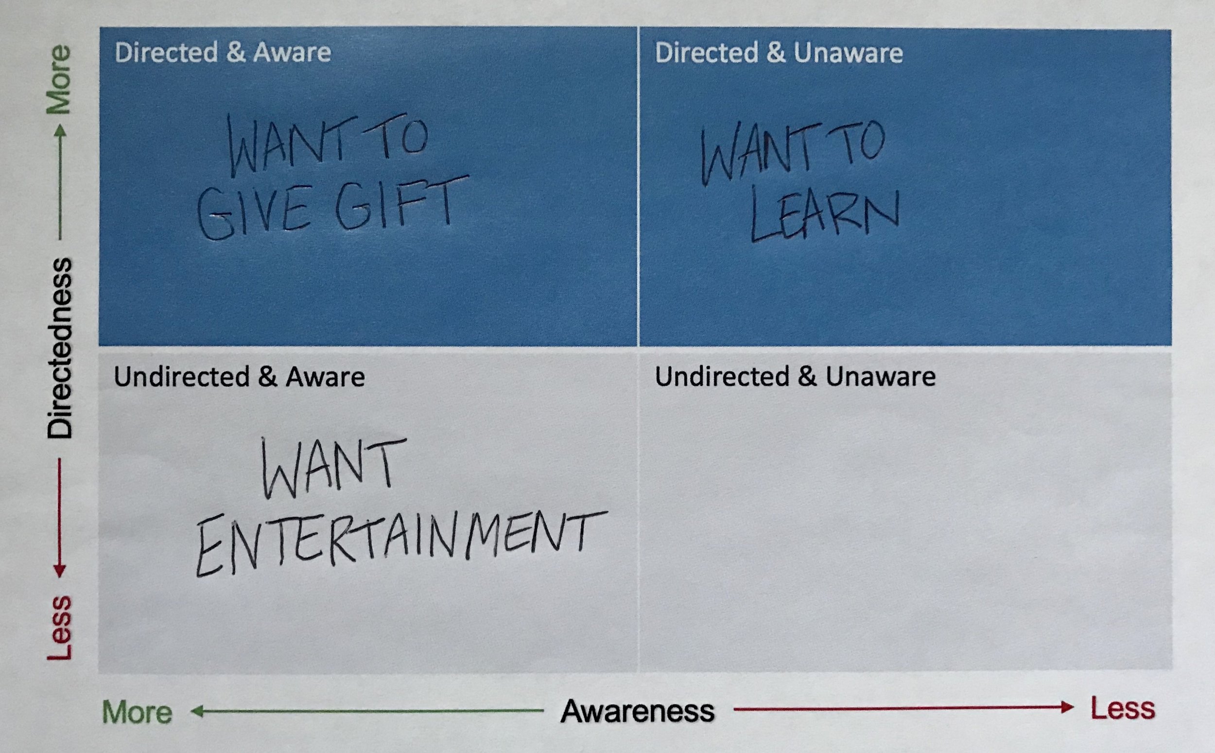
With these business goals in mind, I identified and defined the primary audience groups, classifying these groups using a continuum scale of directedness and awareness to best categorize and consider the needs of Audible’s key users. This categorization was helpful in understanding why visitors were coming to the website, what their needs were, and what tasks they were seeking to complete.
Current Landscape
To understand the landscape of the website, I outlined the current structure in a sitemap using Excel. This facilitated my review of Audible’s navigation, terminology, content layout, workflow, and page layout.
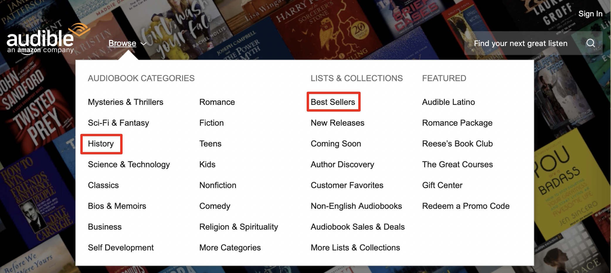
During this exercise, I identified several navigation challenges in the website’s current sitemap.
The categories in the primary navigation contained more than 10 items, were not mutually exclusive, and used thematic categories abundantly.
Key tasks were hidden within the tertiary navigation and footer (e.g. sending a gift, redeeming a promo code).
It was unclear to users from the global utility navigation that they need to sign in to their Amazon account to subscribe for an Audible membership.
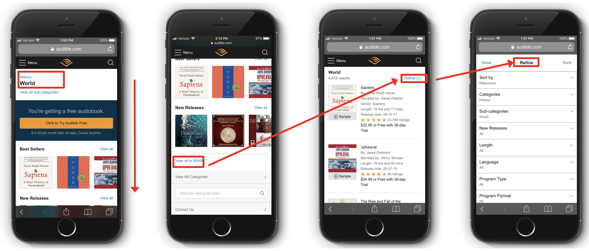
There was no way to refine results when searching for an audiobook with specific attributes on the website.
User Flows
To illustrate these navigational challenges, I created a sample scenario based on the key audience groups and developed user flows for both desktop and mobile. These user flows served as an aid in understanding the structural issues and devising recommendations.
Based on the current site map and user flows, I next established redesign goals for the information architecture.
Redesign Goals:
Make important information for key tasks easier to find in the main navigation.
Consolidate thematic categories under 'Explore Featured’ and use them sparingly.
Use an alphabetical ordering principle to make items easier for users to scan and comprehend.
Include ten items or less per category using a ‘view all’ option.
Utilize filters to simplify the main navigation, refine results, and aid in mutually exclusive categories.
Enhance consistency of navigation throughout the website (specifically the global header and footer).
OUTCOME
Based on these redesign goals, I designed a future sitemap and created updated versions of the user flows to display my recommendations for Audible’s information architecture. I made wireframes for key pages using Sketch for both desktop and mobile. These two deliverables directly address the global and user-based issues identified in the current sitemap and user flows and remain true to the business goals. This recommended navigation structure enables Audible to be a more usable, findable, learnable, and discoverable website, creating a better experience for its current and potential customers.
Desktop Wireframes
Mobile Wireframes
NEXT STEPS
This project was for a graduate level class, and we were not working directly with the company. For next steps, I would test my redesign with users to iterate further and improve upon the Audible website. With a considerable budget, I would use Treejack to validate the site’s proposed hierarchical structure. Without monetary support, I would continue on with a closed card sort. These tests would provide feedback on the proposed navigation structure and direct the redesign toward further improvement.


