Product UI Redesign for Improved User Experience
THE PROJECT
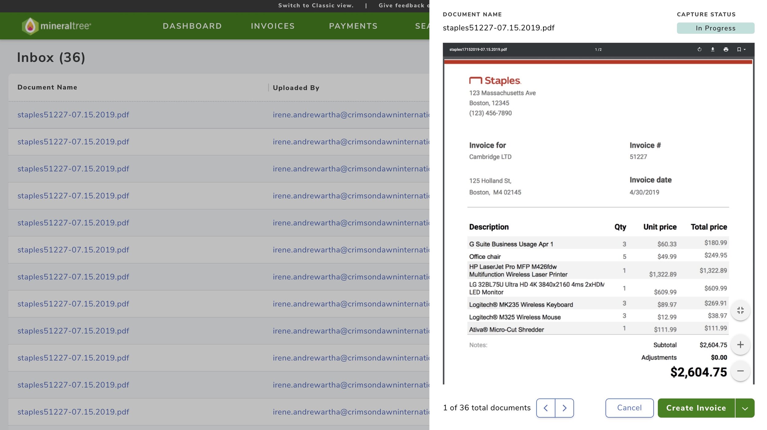
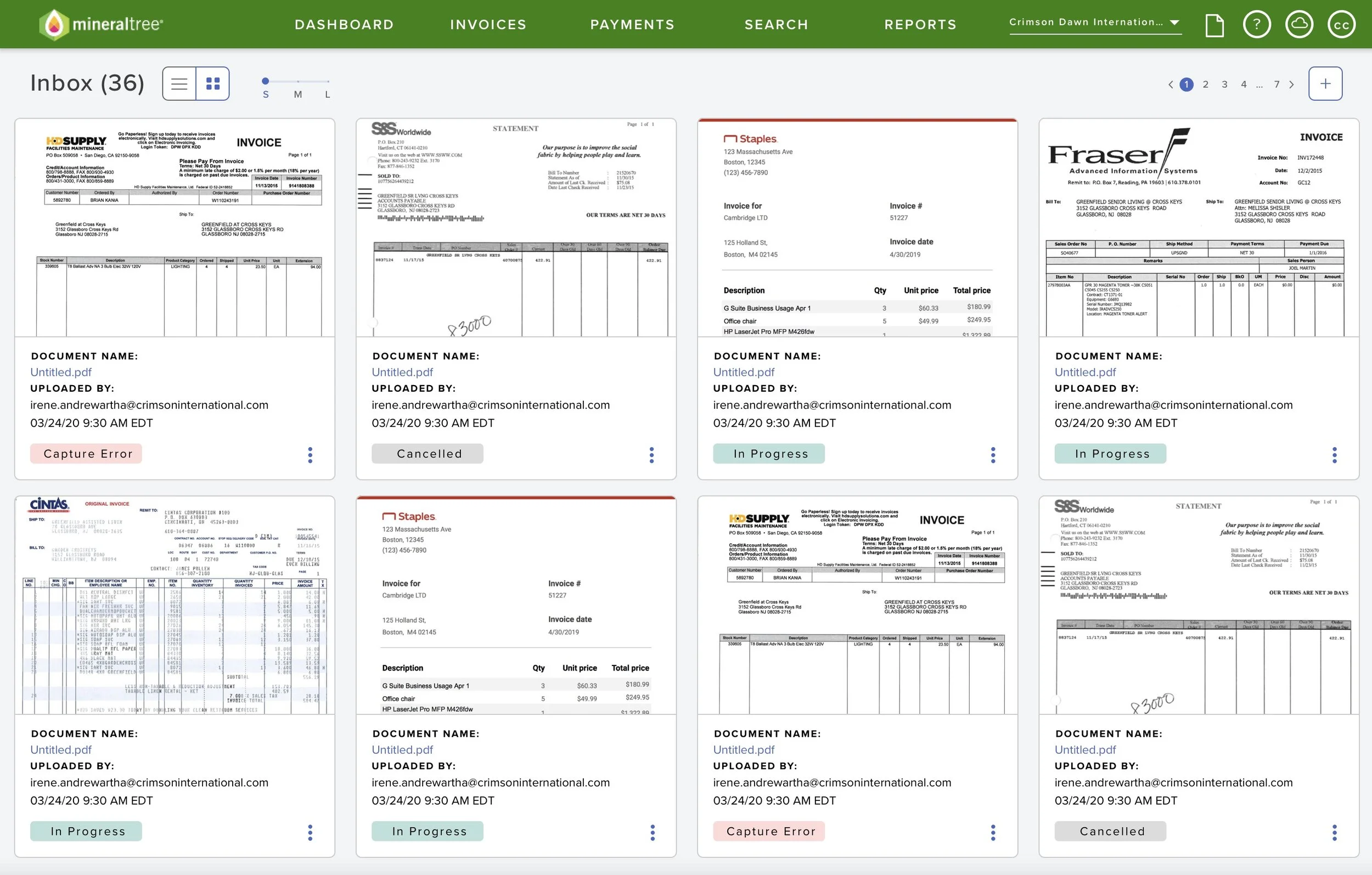
This example is part of a large scale product redesign and describes my process for redesigning the inbox feature. The inbox is where documents enter the application and become invoices, and the legacy design had cumbersome scrolling functionality, was missing clear document statuses, and users had difficulty sorting and filtering the list.
The new inbox has a clean and intuitive interface and has improved the user experience for customers. To initiate this project, I planned and conducted usability studies, analyzed results along with data analytics, and translated the results into specific design requirements. I contributed to building wireframes, mockups, and prototypes that were used in testing and presentations. Toward the end of the project, I was focused on ensuring the new design was consistent with the other new features of the application, focusing on colors, components, spacing, UI patterns.
Now that this feature has been released, I am monitoring the product feedback received, responding to inquiries and prioritizing enhancements for the development team’s backlog. All of the work for this feature occurred in a fast-paced, agile environment.
*Please note these images do not include real company data or logos.
THE PROCESS
To being the project, I studied the legacy application in detail to mirror the functionality that exists today and have planned for current and future product enhancements. The design decisions were based off of data analytics collected from the legacy application and user feedback collected through usability testing.
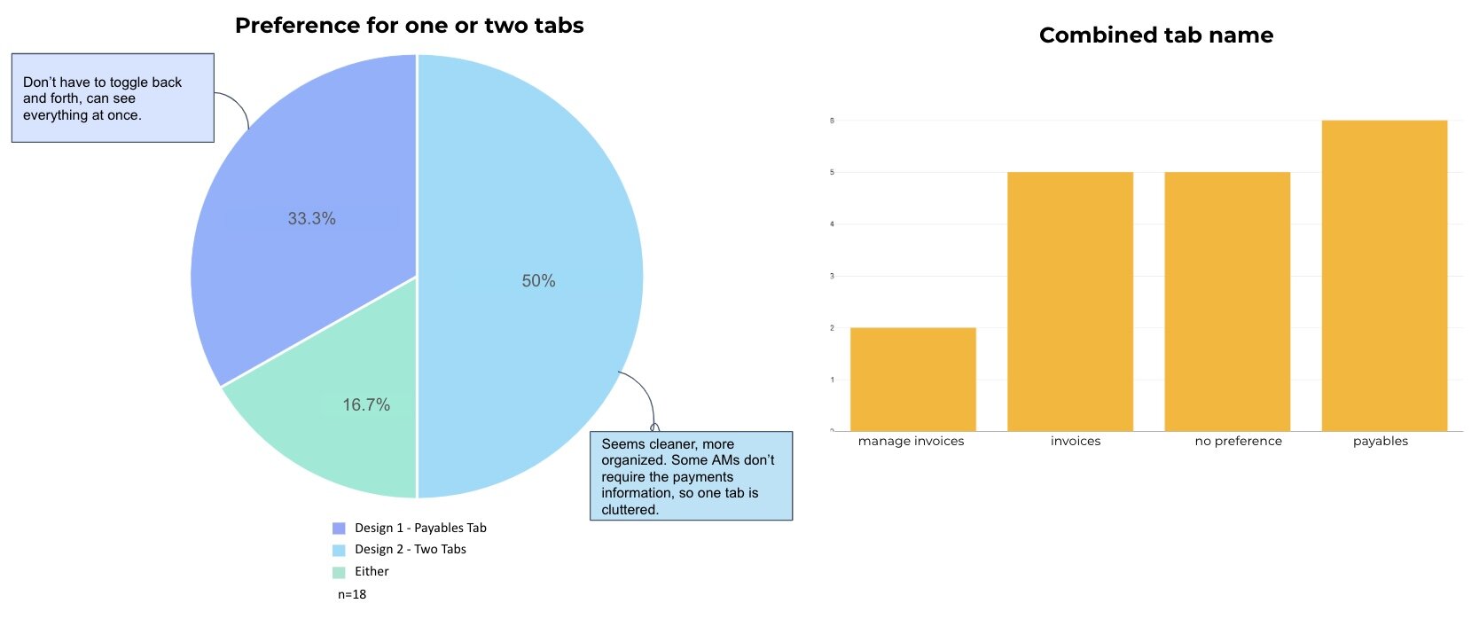
I collected user feedback from 100+ users through remote usability sessions by recruiting current customers, crafting test scripts, conducting sessions, analyzing results in a spreadsheet-database tool called AirTable, and presenting findings to internal stakeholders including senior leadership, designers, and product managers. I also collected internal feedback through 1:1 interviews and small focus groups.
The wireframes, mockups, and prototypes were created and shared using Sketch and Invision. These screens involved design explorations of actions buttons, filters, modals, and data formatting. It was designed to be WACG compliant and uses Material UI components. There were numerous design critiques and styling iterations to arrive at our final solution. These designs utilized our newly created design system that has been developed in tandem with this project, fostering our consistency and efficiency throughout the development of our screens and features.
THE OUTCOME
I led the overall user experience and interface design for the new inbox feature. The design involves multiple workflows, modals, buttons, sorting/filtering, UI patterns, and toggles. The foundation of these new designs grew from existing functionality of the pages that existed in the legacy application, customer feedback, and data analytics. The new design embodies a clean, simplified interface along with streamlined paths for an improved user experience. Since the release of this new design, customers have been providing positive feedback, and I’m excited to continue on the application’s redesign journey.
NEXT STEPS
Now that this feature has been released, I am monitoring the product feedback received, responding to inquiries and prioritizing enhancements for the development team’s backlog. The design of this section of the application has established UI patterns and styling for the subsequent features of this redesign project.


